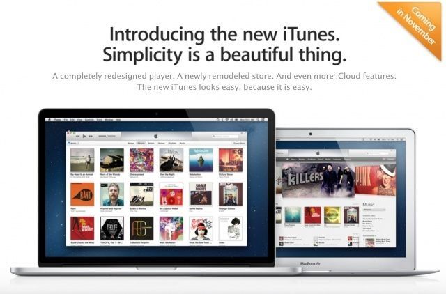
 Apple has released iTunes 11, so whats new in this? Why should you upgrade. Well lets have a look at it.
Apple has publicly claimed that it wanted to “get it right”. Apple has previously pushed the released date of iTunes 11 by a month.
To start with, the new iTunes 11 has been completely redesigned.
The first thing you will notice when you start iTunes 11 is that its FAST! Yes, really fast!
In iTunes 11 the library sidebar has been given the boot in favour of a drop down tab from which you can select your media type. Whilst this frees up a lot a of screen space which will be a benefit on smaller machines, it does require more effort than we’re used to. Luckily Apple gave this some thought and if you wish, you are able to bring the sidebar back.
Apple’s new “Expanded View” looks like a cross between the classic information-based view when you’d click an album and Cover Flow. Basically, it shows you the songs in an album (or presumably from an artist you clicked), and keeps the Cover Flow-like view across the top, just not as massive and visually overpowering as it is now. The upshot is that it makes navigation easier, sort of, since you’re not dumped totally into a list view. But it’ll probably feel extraneous to a few of you who find the navigation options (just the albums or artists immediately before or after what you’ve selected) not worth the wasted space.
iCloud speeds for thousands and thousands of songs seem very fast. It loads album artwork at the speed of scrolling. Other new online features, though, are bogged down right now. That probably has to do with the whole world downloading and trying out the new iTunes, though.
This will either be the most minor change, since most of you probably don’t use the MiniPlayer, or be the thing that finally gets people to actually use the MiniPlayer. Apple’s stripped off most of the controls, like skip forward or backward, play and pause, and volume control, since Macs have hardware buttons for that now that are more efficient than using the mouse or trackpad. Still, they appear if you mouseover the pane—they’re just out of your way when you don’t need to look at them. The standard buttons check the next few songs, search the rest of your library, or just expand to the full window, or allow you to select which speakers (via AirPlay) you want to use. It’s probably not quite as efficient as keeping iTunes in a separate Space, but if you like having iTunes on your desktop in some form, it’s a nice and thoughtful change.
 Thfire.com Everyday news that matters